


Tesla’s user interface isn't just a high point in the brand's success, it might be the best UI in the history of the automobile. Period. It’s a digital control center that redefined what we expect from a car interior.
While Tesla’s UI is a triumph of design and vision, it still leaves room for the sort of practical frustrations that drivers notice when they’re actually out there, behind the wheel.
What Makes Tesla’s UI So Great
Make no mistake, this isn’t your grandfather’s iDrive or the laggy garbage Chrysler shoved into its fleet in the early 2010s. Tesla’s system is fluid. Tap, swipe, and scroll through functions with the sort of responsiveness that makes other brands’ efforts feel like using a Palm Pilot underwater. It’s deeply integrated. It works.
So well, in fact, that you won’t find Tesla drivers crying out for Apple CarPlay or Android Auto the way Toyota and BMW owners do. Why? Because Tesla doesn’t need them, but it doesn’t come without its drawbacks. The UI is the OS, and the OS is the car. If that sounds like heresy to you, spend ten minutes with one on the freeway.
How Tesla Compares To Others
- Many in-car infotainment systems suffer from convoluted menu structures, sluggish responsiveness, and inconsistent designs. For instance, some systems bury essential functions like climate control or navigation under multiple submenus, making them difficult to access quickly. This complexity can lead to increased driver distraction, as users spend more time navigating the interface rather than focusing on the road .
- The trend toward replacing physical buttons with touchscreen controls has raised safety concerns. A study found that nearly 90% of drivers prefer physical buttons over touchscreens for essential functions, citing the need to keep their eyes on the road . Touchscreens can be less intuitive and require more visual attention, increasing the risk of accidents due to driver distraction.
- In response to the shortcomings of native infotainment systems, Google and Apple developed Android Auto and Apple CarPlay, respectively. These platforms allow drivers to integrate their smartphones with the vehicle's infotainment system, providing a familiar and streamlined interface for navigation, communication, and media playback. By leveraging the smartphone's capabilities, these systems aim to reduce driver distraction and improve overall usability.
But even the best software in the world can suffer from the sort of real-world oversight that reminds us why we used to rely on knobs and switches. One Reddit user, tysonedwards, nailed it with this sobering bit of truth:
“I’ve never had as many ‘Keep your eyes on the road’ alerts as when I was trying to see: ‘what time is it?’ Or ‘what is my ETA?’”
That’s not just a usability issue, it’s a safety concern. Tesla may have killed the button in the name of elegance, but not all of us want to take our eyes off the road just to figure out if we’re running late.
An Open Letter From r/TeslaSupport
And that’s where a post from Alpinekiwi on r/TeslaSupport comes in like a well-penned letter to the editor, offering two simple, almost embarrassingly obvious, ways to make a great system even better. In full:
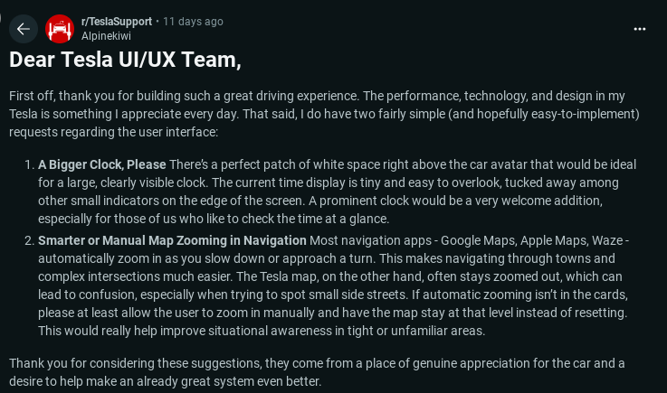
“Dear Tesla UI/UX Team, First off, thank you for building such a great driving experience. The performance, technology, and design in my Tesla is something I appreciate every day. That said, I do have two fairly simple (and hopefully easy-to-implement) requests regarding the user interface:
Advertising
A Bigger Clock, Please… Smarter or Manual Map Zooming in Navigation… Thank you for considering these suggestions, they come from a place of genuine appreciation for the car and a desire to help make an already great system even better.”
How Do Manufacturers Get Feedback?
- Manufacturers utilize tools like post-purchase surveys and Customer Satisfaction Index (CSI) scores to assess customer experiences. These insights help identify areas for improvement in products and services.
- By analyzing feedback from platforms such as Google Reviews and social media channels, manufacturers can gauge public perception and address concerns proactively.
- Partnerships with organizations like J.D. Power allow manufacturers to access in-depth market intelligence and benchmark studies, providing valuable data on customer satisfaction and product quality.
And just like that, the floodgates opened. User TechWiz2025 chimed in:
“+1 to the clock request. It is so hard to get current time at a glance, you always have to concentrate to find that clock and then try to make up those little numbers.”
Another user named, nobody-u-heard-of, said what we were all thinking:
“Right now I just have my phone face up on the charger and I can read the clock there because it's huge and always on.”
Think about that, Tesla designed one of the most advanced infotainment systems ever built, and folks are glancing at their smartphones for the time. That’s like building the Eiffel Tower and forgetting the elevator.
The second suggestion from Alpinekiwi was just as important, and just as overlooked: better map zooming.
“Most navigation apps, Google Maps, Apple Maps, Waze, automatically zoom in as you slow down or approach a turn.”
They wrote.
Advertising
“The Tesla map, on the other hand, often stays zoomed out.”
It’s a small thing until you're trying to figure out which of three near-identical side streets you’re supposed to turn onto. Tesla, for all its AI-driven navigation brilliance, somehow missed the part where context matters. If Google figured it out in 2011, surely the car that can drive itself should know when to zoom in.
Is The Tesla UI Really That Good?
But the story doesn’t end with time and maps. Tesla’s UI has become a kind of canvas for owners, an open invitation for user-driven creativity and critique. Glittering_Alps_8901 offered this nugget of whimsy:
“Why couldn’t the dash do the plaid animation any time you’re accelerating quickly in Plaid mode… Sincerely, A child at heart.”
It’s not just about speed, it’s about joy. Tesla’s UI is so captivating, so deeply tied to the identity of the car, that people want it to play with them. It’s a relationship, not just a screen.
And then there are the deeper, brain-breaking UX quirks. Take ilusnforc’s observation about Full Self-Driving mode selection:
“You pull the scroll wheel right to get 'hurry' for it to move left… then you push the wheel to the left to get it to move to the right lane. It almost breaks my brain.”
That’s the sort of backwards logic that might pass muster in a UX lab but gets chewed up and spit out on a Monday morning commute. It’s not a fatal flaw, but it’s a reminder: sophistication should never come at the cost of instinct.
Tesla’s UI remains a marvel, one of the finest ever bolted into a production vehicle. It’s smart, it’s ambitious, and most of the time, it’s downright elegant. But even the most revolutionary designs need iteration. A bigger clock and smarter maps aren’t moonshot requests, they’re the kind of everyday conveniences that keep the future feeling human. Because as Tesla pushes the industry forward, it’ll be the little things, visibility, usability, common sense, that separate the merely futuristic from the truly timeless.
Are you happy with the UI of your Tesla, or do you somehow wish it were different?
Let us know your thoughts in the comments below.
Image Sources: Pexels
Noah Washington is an automotive journalist based in Atlanta, Georgia. He enjoys covering the latest news in the automotive industry and conducting reviews on the latest cars. He has been in the automotive industry since 15 years old and has been featured in prominent automotive news sites. You can reach him on X and LinkedIn for tips and to follow his automotive coverage.
Set Torque News as Preferred Source on Google
Follow us today...


