If you’ve followed the frequent and useful Consumer Reports newsletters concerning cars that are the most reliable, cars that get the most miles per gallon, cars that are the best price, and cars that have the best Overall Scores consisting of many separate---but related---factors, it can be difficult to sort out just which make and model is the best one for you.
In other words: too much information that sometimes appears contradictory. But needn’t be, if you use a simple tool like a Venn Diagram to reveal the EV that best meets your needs of both reliability and range.
Venn Diagram Basics
A Venn diagram is a visual representation of the relationships between different sets or groups. According to the Encyclopedia Britannica it is named after John Venn, a British logician who introduced the concept in the late 19th century. Venn diagrams are commonly used to illustrate the overlap or commonalities between sets.
Here's how a Venn diagram works:
1. Basic Structure:
- A Venn diagram is typically composed of circles (or other shapes) that represent different sets or groups.
- Each circle represents a set, and the elements within that circle belong to that set.
2. Overlapping Regions:
- When two or more sets have common elements, the circles overlap to indicate this intersection.
- The overlapping region represents the elements that belong to both sets.
3. Non-Overlapping Regions:
- The non-overlapping parts of each circle represent the elements that are unique to that particular set.
4. Example:
- Let's consider two sets, Set A and Set B, where Set A represents even numbers (2, 4, 6, 8, 10, 12, 14, 16, and 18) and Set B represents multiples of 3 (3, 6, 9, 12, 15, and 18).
- Circle A would include the even numbers, and Circle B would include multiples of 3.
- The overlapping region would include elements that are both even numbers and multiples of 3 (i.e., 6, 12, and 18).
Venn diagrams can range from simple visuals to more complex representations of data commonly used in various fields, such as mathematics, logic, statistics, and problem-solving.
In summary, Venn diagrams provide a clear and intuitive way to illustrate the relationships and intersections between different sets, making it easier to understand the characteristics and commonalities among various groups or categories.
For our purposes, we are looking at a Venn diagram for simple sorting that could be done on paper drawing connecting lines or on a spreadsheet program; however, is easier and more clearcut using a Venn diagram.
Let’s Venn Diagram Two Consumer Reports EV Newsletters
First, decide on at least two different factors that are the most important to you when it comes to an EV.
For example, this week, CR analysts released two newsletters that individually focused on the “Best Electric Cars” and “Electric Vehicles That Can Go More Than 250 Miles on a Charge.” Both of which are very informative and a good example of Venn diagramming possibilities you can try at home.
According to CR analysts:
“…we don’t recommend every EV we’ve tested. Just like vehicles with an internal combustion engine, EVs have varied results in Consumer Reports’ tests and owner surveys. Many of them have performed well in our road tests while others faltered. Some have proved to be reliable, as reported to us by vehicle owners in our Annual Auto Surveys. And while many come with a full complement of advanced driver assistance and safety features as standard equipment, these features are optional on a few electric cars—and some automakers don’t even offer the full complement.”
Hence---perfect for Venn diagramming.
In this example we will choose the focus of the two newsletters as separate data sets: Best Electric Car (i.e., Overall Score ratings) and EVs that go more than 250 miles on a single charge.
CR Best Electric Cars Data List:
Hyundai Ioniq 6 2024
BMW iX 2024
BMW i4 2024
Kia EV6 2024
Porsche Taycan 2024
Genesis GV60 2024
Lexus RZ 2024
Tesla Model Y 2024
Tesla Model 3 2024
Kia Niro Electric 2024
CR Electric Vehicles That Can Go More Than 250 Miles Data List:
Lucid Air 2024
Tesla Model S 2024
Hyundai Ioniq 6 2024
Mercedes-Benz EQS 2024
Tesla Model 3 2024
Tesla Model X 2024
Tesla Model Y 2024
Ford F-150 Lightning 2024
Polestar 2 2024
Kia EV6 2024
BMW i4 2024
BMW iX 2024
Hyundai Ioniq 5 2024
Mercedes-Benz EQE 2024
Genesis GV60 2024
Volkswagen ID4 2024
Rivian R1S 2024
Audi Q4 E-Tron 2024
Kia Niro Electric 2024
Toyota bZ4X 2024
Simple Venn Diagram Creation Online
Now that we have our two data sets, you can plug the data into the www.goodcalculators.com website and choose the Venn Diagram Maker function.
The Venn Diagram function opens with two field boxes in which you will copy and paste (or load a data file option) the two data sets separately. Be sure there are no punctuation marks like commas or periods in the data set as that will confuse the calculator function. And, be sure to use labels for the data sets so as to make interpreting the Venn Diagram easier---I labeled mine as “Best EV” and “Best Range.”
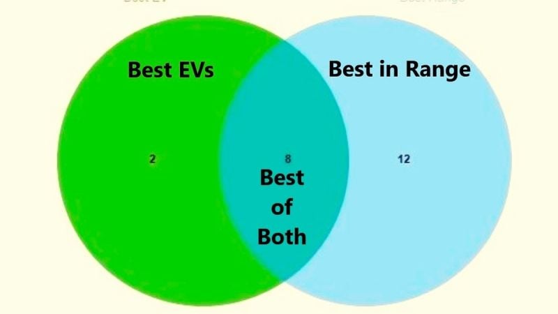
After pasting the data in their fields, simply click on the “Draw” button and a Venn diagram will appear with a table showing which models were unique to each of the two sets; and more importantly, the data that shows which models the two sets shared the characteristics of “Best Electric Car” and “EVs that go more than 250 miles on a single charge.”
In this example, the results show that 8 models met the criteria, thereby helping you narrow down your Consumer Reports recommended car lists to these following models:
- Hyundai Ioniq 6 2024
- BMW iX 2024
- BMW i4 2024
- Kia EV6 2024
- Genesis GV60 2024
- Tesla Model Y 2024
- Tesla Model 3 2024
- Kia Niro Electric 2024
Please Note: The actual Venn diagram generated is the article image.
Further Notes to Venn Diagramming
A caveat to Venn diagraming is that your results are only as good as your data points in a set. For example, CR analysts note that they have not tested ALL EV models, particularly some of the newer ones not yet tested and evaluated by CR analysts. Therefore, some models might be missed that could alter the overlapping…and your decision making.
However, the usefulness of a simple (albeit limited) analysis tool such as the exampled is a good starting point for someone who needs a little help sorting out all the car-related information out there into a tailored assessment that can be more useful.
Furthermore, with a little imagination you can further refine the data by specifying only those models that rated at 300 miles per charge or more. Or if you want to get your nerd on, compare/contrast Consumer Reports data on actual road-tested EV range versus what the manufacturers and the EPA (Environmental Protection Agency) lists using Urban Dynamometer EV range testing.
For additional articles related to recent new and used car recommendations, here are three for your consideration:
- 10 Most Reliable 2024 Car Models and What They Will Cost You
- Consumer Reports Best Used SUVs, Sedans, Small Cars, and Trucks Guide for Shoppers
- Consumer Reports Recommends These 10 Cheap Cars
Timothy Boyer is an automotive reporter based in Cincinnati. Experienced with early car restorations, he regularly restores older vehicles with engine modifications for improved performance. Follow Tim on “Zen and the Art of DIY Car Repair” website, the Zen Mechanic blog and on Twitter at @TimBoyerWrites and Facebook for daily news and topics related to new and used cars and trucks.
COMING UP NEXT: Popular Toyota SUV Gets a Thumbs Down from Consumer Reports
Image source: Author’s own
Set Torque News as Preferred Source on Google


