
Celebrating its 60th year of modern research and development, Ford is particularly cognizant of the aging population of its customers, particularly the rapidly increasing numbers of drivers 60 and older.
For the first time, people age 65 and over outnumber children under the age of 5. It’s a transformation that’s changing the world, along with all kinds of products in it.
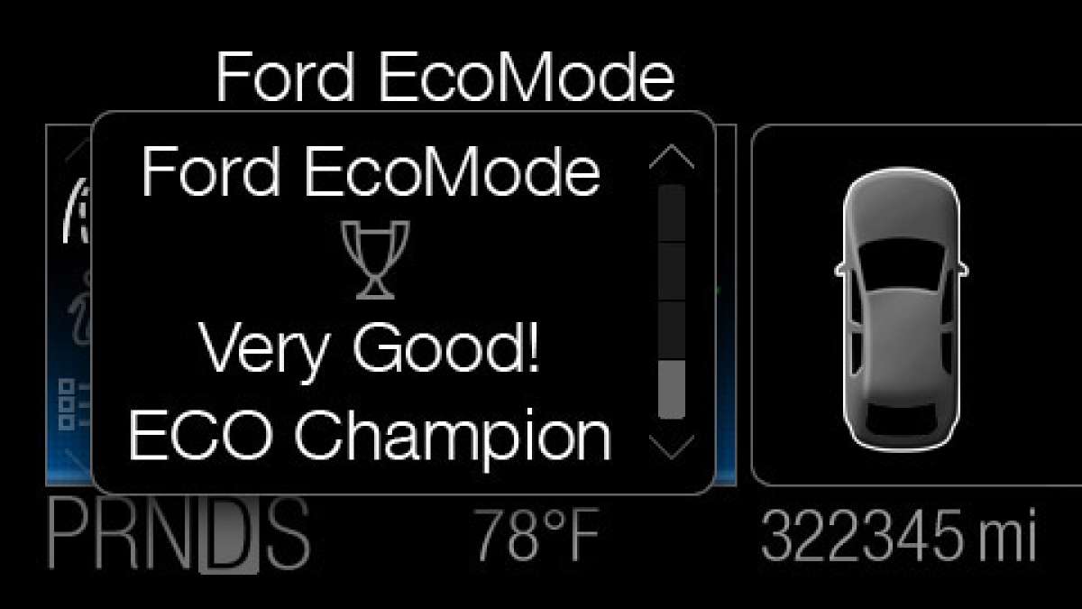
That is why fonts will be increased in size by up to 40 percent starting with the Ford Edge and Explorer which will arrive in dealers next year. The new graphics and communications will roll out to other Ford vehicles.
The Study of Fonts Not New
Typography has been analyzed as far back as World War II, as the military studied fonts in the cockpits of aircraft and the bridges of ships. The study continued after the war to include household products.
For the record, the latest change for Ford with new fonts stemmed from customer research. Ford’s legibility study, for example, used Ford engineers for the younger subject and local retirees for the older group.
The study found that even small changes in the fonts used in interior graphics can make them easier and quicker for drivers of all ages to read and recognize.
The letters and numbers that form words and convey other information on the center stack display on the next-generation vehicles will be slightly thicker, with an approximate wider stroke width of 40 percent.
As a former design engineer who had to layout and place graphics for vehicles, I have to agree with the media release that stated there are three aspects to font reading: size, shape and contrast level.
The key is to make the words and numbers a bit bolder, but not overwhelming, said Research Engineer, Shannon O’Day. Even with high-tech gadgets and components, simpler often works better; and the key is to pay attention to the width and stroke of the text, allowing them to play off each other.
“If you choose wisely, the legibility of even relatively small text can be a comfortable reading experience,” she said. That is especially helpful for drivers on the move.”
O’Day authored “Legibility: Back to Basics,” a proprietary Ford study that indicates which fonts provide better legibility for drivers of all ages - looking at the needs and limitations of older drivers. Interestingly, you drivers experienced issues with many of the same fonts, albeit at a much lower rate.
Bottom Line
The results of the Ford studies matched medical trends: Doctors say our eyes exhibit a natural age-related decline in performance. It begins after the age of 40, and tends to increase as we reach our 60s and beyond. The lens of the eye begins to harden, and our focusing ability lessens; plus our visual field narrows while our ability to see in low light decreases.
Good news is, Ford’s own testing demonstrated that when the older group could easily read a particular font, the two younger groups, age 45 to 59, and under age 45, could read it as well.
-----------------------
About the Reporter: After 39 years in the auto industry as a design engineer, Frank Sherosky now trades stocks, futures and writes articles, books and ebooks like, "Perfecting Corporate Character," "Awaken Your Speculator Mind", and "Millennial World Order" via authorfrank.com. He may be contacted here by email: [email protected]
________________________________________________
Additional Reading:
Ford advances in-car voice interactions with Nuance (Nasdaq: NUAN) collaboration
Ford SYNC leading race to integrate smartphone apps into cars
Ford Motor Company (NYSE: F) stock still sliding lower
Ford among top honors for 2011 Edison Best New Product Award
Toyota Motor Company stock price action is robust within market sell-off
GM stock breaks to new low, the 6th in past 11 days
Toyota requests dismissal of shareholder suits over unintended acceleration
Set Torque News as Preferred Source on Google
Follow us today...


Comments
Good! I hope they can make a
Permalink
Good! I hope they can make a radio and temperature control font that doesn't rub off of the buttons over time. It's hard to see that too!